This is an excellent article by @burkhard that I had not read before.
The chart in the article caught my attention:
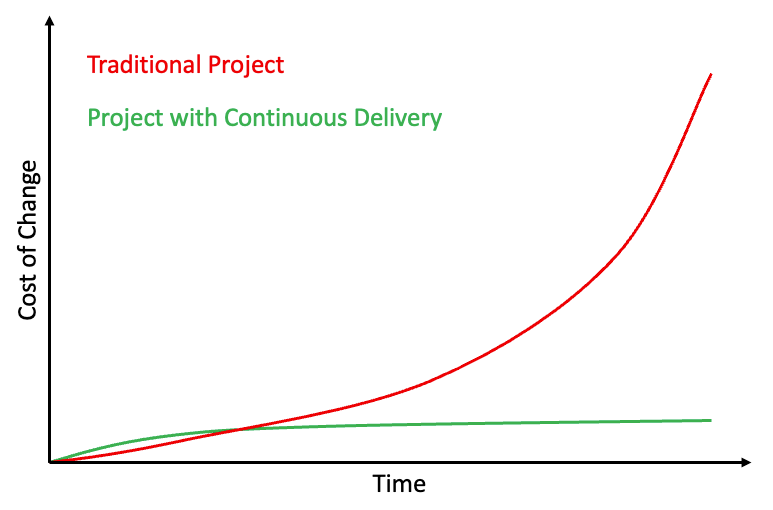
The red line is an excellent illustration of technical debt.
It is also interesting to compare to a chart I created in a recent article:
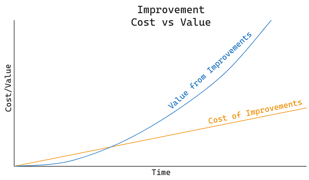
Both charts illustrate that it takes time before the value of improvements and automation kick in.
Are you playing the short or long game?